

Styling
These limitations often push web developers to use libraries that provide custom select-like controls. Unfortunately using a library comes with important implications: including it in your project increases complexity, your customers will need to download the library code on each visit, and the custom select might not support keyboard navigation or the same accessibility semantics that built-in
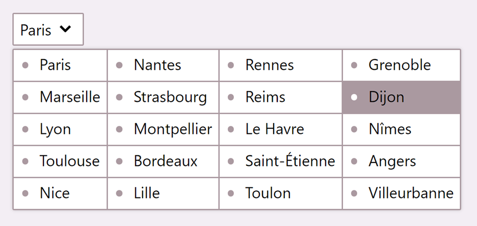
In this article, we’ll review the current state of styling
But before we dive in, let’s review the three main parts of a
- Button: this part is visible to users before they interact with the
- Listbox: this part appears when the button is selected and serves as a container for the options.
- Options: these parts are displayed in the listbox and represent the choices users can make.
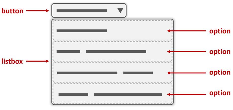
I’ve left out the optgroup part from this list and diagram for simplicity reasons. Let’s not worry about it in this article. Also, the part names I’m using here are not meant to match the actual accessibility semantics of the
With this out of the way, let’s review how the various parts can be styled today.
Styling the button part
Doing this is pretty easy nowadays. We can apply CSS properties to the
With this, we can pretty quickly go from the default style of the

Even better, styling the button part works very well across browsers. Back in 2018, the Filament Group design studio published Styling a Select Like It’s 2019, a blog post and CSS code snippet that showed how to style a
Styling the listbox part
Sadly, there’s no way for web developers today to style the listbox. There simply is no way to target this part of the
As a result, we can’t change the default shadow, border, corners, background color, or padding of this box to match the rest of our website.
It’s important to realize that this part does play an important role in how a
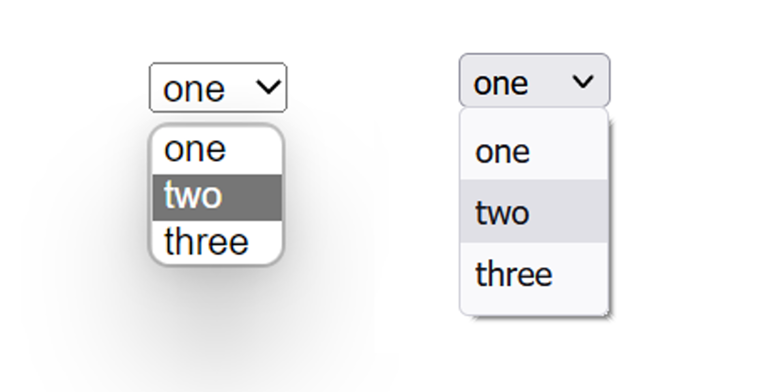
As this example shows, the listbox part comes with a few things you might want to customize to your needs:
- the way the shadow drops on the rest of the page might not work well with the rest of your styles,
- the color, thickness, and rounding of the border might feel a bit out of place as well.
Depending on the browser, and operating system, the listbox part may be implemented with internal user-agent shadow DOM, or directly by the OS, none of which can be targeted by our CSS unfortunately.
Styling the option part
For this final part, things are a bit better. Several CSS properties can be used to change the appearance of an option, and some properties applied to the
For example, it’s possible to change the color and font of the
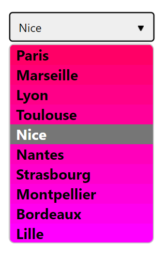
Unfortunately, only a small subset of CSS applies to options. Today, in Microsoft Edge (and any other Chromium-based browser), only the following CSS properties are taken into account:
- background-color
- color
- direction
- font
- font-family
- font-size
- font-style
- font-variant
- font-weight
- text-align
- text-transform
- visibility
This is a good list, and it should be sufficient in most cases. But many interesting effects will not be possible to achieve. As an example, adding horizontal borders between options isn’t possible, and so is adding padding in options to give them more room to breathe. One of the most requested feature is the ability to add images next to options, and this is sadly not possible either since the background-image property doesn’t work. One other example of an interesting effect is using a grid or a flex layout to display the options in a different way. Sadly this is also not possible.
Enter the element
There’s good news! Some time ago, a cross-company group of people got together ago and formed Open UI. Their goal is to create specifications for much more extensible and stylable UI controls on the Web. And then work with standard bodies and browser vendors to get them implemented. This is a part of the Web that has, historically, been left out of standardization, and up to browser implementations to deal with on their own. So it’s a very exciting project that aims to fill one of the major remaining gaps on the Web platform today. Also, the people at Open UI are great, and you can join them to follow along or even push some of the proposals!
Part of the work the group has done so far is already starting to come to fruition. The Microsoft Edge team has started to implement a new HTML element in Chromium, in collaboration with Google, based on the Open UI : the
The element is only available in Chromium-based browsers for now, and to use it, you’ll have to switch the “Experimental Web Platform features” flag in about://flags first.
Using
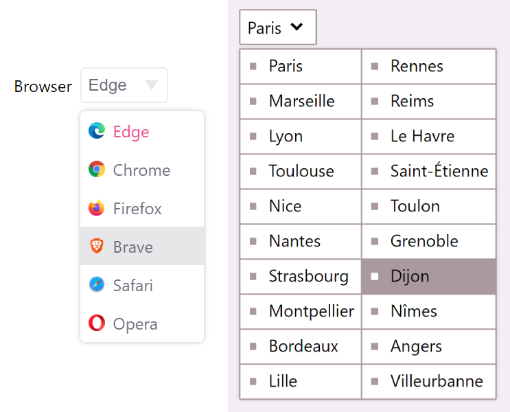
Notice the custom borders and shadows, the separators between options, the images, and custom layout.
Here is part of the HTML and CSS code that was used for the demo on the right, with the list of cities:
The new
If you want to learn more about Open UI, the
Keep in mind, however, that this is very new and experimental. The spec and implementation will most definitely change as the result of ongoing discussions.
But why does this matter?
You might argue that styling the color and font of options is more than enough, and anything more is not really necessary. After all, a select is made for users to quickly choose an option from a list and that’s it. If you, as a web developer, cannot style this part of your user flow and instead are forced to rely on what the browser and OS provide, then at least your users will have a familiar and optimized experience.
Take iOS for example, the iPhone and iPad operating system, options on this platform can’t be styled at all, even choosing a different font or color doesn’t work, for good reasons. As the available room may be limited on the device, it’s great that the OS can take over the rendering, positioning, sizing, and styling of the list of options for users to effectively make their choice in a familiar UI.
So, if you need your users to choose from a list of options (and if other solutions like a bunch of radio buttons aren’t feasible), using a native
But, even if you agree with the above, and I hope you do, I believe a new element like
If you were about to start creating your own custom select, I suggest you read Sarah Higley’s excellent 2 part blog post, “Select your poison”, about it first.
So having a fully stylable select element on the web is an important step in the right direction. It will allow web developers to define the extra styles they need and provide a coherent design, while preserving accessibility and simplicity.
There’s a progressive enhancement story to this as well. The new
Note, however, that at the time of this writing the
Doing this, however, means that the browser might no longer be able to guaranty the accessibility of the control like it can today with a normal
Closing notes
As we’ve seen, styling selects on the web isn’t as bad as it used to be in the past. Using the HTML
And now, with the work that Open UI and Microsoft are doing, there’s an even brighter future ahead of us. One where we can style the contents of our selects just like we’ve always wanted, without the added complexity.
Are there other things you wish the Web could do? Let browser vendors know, submit your ideas on The Web We Want!
– Patrick Brosset, Senior Product Manager, Microsoft Edge